
I have started to take the letters that make up the alphabet for Charles Darwin, and I am visualising the angles of the baseline, the x height, etc, and also the angles that each line makes with the horizontal and the line thickness.

This pattern is now getting a little too complicated. What I have done is positioned the lines so that the letters that correspond with each other line up with each other. However, after consideration, I am just going to line up the baseline lines of the type to create my line pattern now, and focus on creating a pattern that just includes the decender height, the x height, the baseline height and the angle that the type meets the baseline. This will then be recorded on one image, and all of the letters will be recorded with the corresponding angle lines.
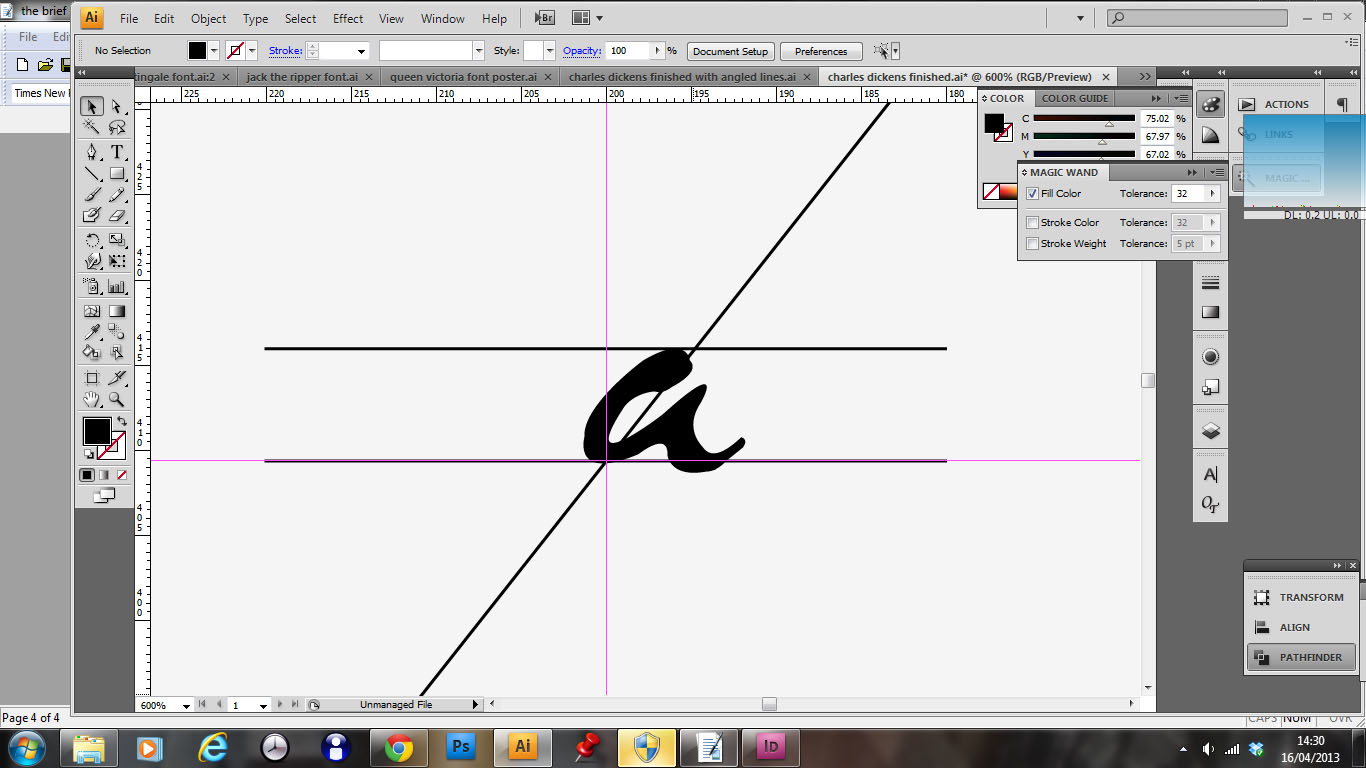
Here I have neatened it up. I have set up a system so that the angle that the letter is written at runs through the centre of the baseline line. Now, I will position all of the x-height lines and type angles to this baseline set-up

I am also documenting which angle lines correspond to each letter. Already I am noticing that the x-heights of a and b are almost identical. This is a very interesting point.

The letter g is proving particularly difficult to register an angle line that the font makes with the horizontal. In the end, I have chosen to adopt a line that runs half way through the width of the x-height and decender line.

This is the structure that I am getting up to h. I think that this is very interesting to look at, it is making a very technical line image and representation of the font. Also, most of the lines relate very close to each other which is interesting. It will be very interesting to see how Jack the Ripper, who scrawled his text into the page rather than delicately writing, compares.

The final pattern that I have made is complicated, but beautifully intricate, exactly as I wanted when I started producing this piece. Now I am going to experiment with smaller stroke thicknesses on all of the lines, and centering of the baseline grid midpoint before I start to experiment with layout and how this could be used in the setting of the gallery space.

I am currently working on the Jack the ripper font, and I have found that the I actually has an angle to the horizontal that is negative. This should create a really interesting composition of lines. Obveously, for me to gage if this system is working, the Jack the ripper lines must create a much more random pattern as Jack the Rippers writing is the least structured and well written.


This is my concept from all of these grid lines. I have a problem now, the lines that I have created do not vary enough from person to person. Even Jack the Ripper looks similar in line structure to baseline as Queen Victoria. This is definitely not my intention. I really like the poster concept above, I want to take this idea through to my next concept. I like the structure of the layout, the two columns of text create an interesting asymmetric and balanced composition. However, I need a new way of illustrating the type for the exhibition. I have come up with the idea of exploring graphology. If I did this, I could analyse the writing styles of the famous Victorians with this research. This should be a more interesting way of approaching the analysis of the writing styles of the 5 Victorians. I want something that people will genuinly be interested in reading and learning. At the moment with these lines I have just created abstract dynamic art.
No comments:
Post a Comment