Saturday 20 April 2013

The lazer cut model

I have etched the lazer cut, as intended, onto the reverse of the plastic. I had some difficulties in gluing the plastic panels together as it requires such a precise angled edge. However, I am very happy with the way that the model has come out. It makes the information so visually interesting.
I think that the lazer cut model looks really effective and exactly how I visualised it. Unfortunetly I could not create the frame that would support the four plastic panels and lift the panels from the ground. However, I do not think that this matters as this plastic model perfectly illustrates how the final exhibition plastic prisms would look. These first three shots have been taken in daylight with natural lighting. It is photographed in a low lit room with a light source placed under the edge of the plastic in the final 3 photos.


Photos of model as would be seen in the exhibition-


I really love the way that these 3 photos have come out. It is exactly how I visioned the etched plastic to look. The text and information glows with the light source placed at the bottom edge of the plastic. The blue tint creates the slight hue which visually distinguishes the 5 Victorian writers (a different hue is used for each prism).

I am very happy with the outcome of this project. I think the idea for the exhibition space really works and is a really interesting and engaging way to present Victorian Writing. 

Tuesday 9 April 2013

Final idea designed

I have been down to see Tim in plastics and he has given me the colours of some plastics that I could use if I was to produce my information onto plastic. My new concept is based around the use of tinted plastic. I want to etch my information onto tinted plastic and make rectangular panels that can be attatched together to form rectangular 3-dimensional plastic shapes. After looking at different etched plastics, I found the the tinted ones show text more clearly. Also, I have found that if the text is etched into the reverse side of the plastic then viewed from the opposite side, you get a really nice smooth finish to the etch and when a light source is placed on the bottom edge of the plastic, the information glows. I love this concept and so I am going to develop the sides of each of the plastic models.


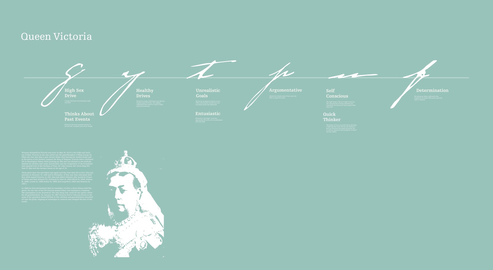
This is my starting point idea. Though it is not panels, It shows an initial concept for layout and structuring of type. I have placed all of the letters that I am highlighting on a baseline so that the overall composition has more structure. I have also included a small biography of Queen Victoria and a stylised image of her (if I am to continue with this idea I will refine this image. I think that now the content is more structured and more visually appealing. I am now going to try translating this into panels. 


This is my idea for the panels. It uses two lines for the baseline where type will be wrapped around. The two baseline lines will run around the 3 sides. The information will be displayed in a column on the left hand side of each of the panels. There is consistancy in type size and leading on all panels and all information. When I have to use a diagonal line to point out an area of the type, then this diagonal is a consistant angle throughout all of the boards. I am structuring the letters and the placement of letters through their use of the upper zones and lower zones. Letters with a lower zone/ decender generally go on the top line, letters with an ascender generally go on the bottom Line. This aids balance and consistency in design. 

 I am now going to work on the editing of the images. 


Process of creating the images-

Here is charles dickens. I have selected a background that is dark. First, I have altered levels so that the background is particularly dark. This increases the detail in the live trace vector image. 


I have to invert the image so that the negative areas are live traced. Otherwise, when i come to lazer etch the images I will have a negative image. 


To make it a vector, I change the path fitting to 1 px and the minimum area to 0px so that I can get as much detail from the image as possible. I then select the ignore white so that only the black areas are shapes. 


I then edit the threshold until I get the amount of detail in the image that I am happy with, here the image has a fair amount of detail but is consistent with the other images I have produced. 


Then when put into indesign, I change the colour of the vector to white. Here you can see a fair amount of detail in the face which I am happy with. 


I am not happy with my Florence Nightingale image and so I am going to re-do this image, I need to select an original image that has a darker background before I proceed with the editing and converting to vector. 


This time the image that I have selected has a darker background initially. 


This has resulted in a much better vectored image that does not have a background, other than a little bit of shadow in the bottom left corner above her shoulder. This has created a much better final image that is consistent with the other images on the other boards I have designed. 


Looking at the overall layout of the four boards, there are a couple of things that bother me. Firstly, all of the information is too high and not centered. This is fine, I can just move all of the information down slightly. I think that it should be slightly higher than center but only marginally, just so that it looks balanced. I need to sort out the text placement. Also, non of the text is aligned with the board it is next to, so the information looks unorganized  I am going to re-position text and restructure the lines linking the information with the relevant parts of the type so that the text is more orderly. 


Now the type is much more ordered and is easier on the eye. I now just need to do this for the other 4 sets of boards for the 4 Victorian writers. 


Here, I have changed the height of some of these boards so that the free-standing structures have a varying height (to make them more visually interesting and dynamic to the viewer). Then, I need to change the background colours of these boards. They are going to just have a tint of colour. My colours need to reflect this. The one shall be a blue tint, so this one is already done. I think I will make it easier on myself to edit them the way that I intend if I put them all into one document so that I can view them all together. That way, I can also check on consistency of information layout. 


In order to get a convincing 3d model of what I am designing, I have applied a gradient to the background colour of each of the panels. Obviously  this in real life would only be a tint of colour, but this is very hard to recreate in indesign and photoshop. I am being considerate in that the light source will come from the bottom, so more colour will be visible in the upper parts of the plastic. 


These are 3 attempts at trying to render a light source. Obviously, the most successful is the panel on the right and so this is the panel I am going to base all of my models on. 


I am creating my 3 dimensional models in Photoshop paying particular attention to the finer detail, making sure that the baseline lines line up around the 3 sides of the shape. 


Here is a completed model of one of the exhibition objects. I have put a platform of plastic in the model so that I can place the original letter that the analysed text has been taken from. I think that I want to put these models on legs as I want an interesting light pattern on the floor of the exhibition space. The exhibition space walls are dark in colour and the lighting low. 


This is the final visualisation of my exhibition space. I have put the plastic rectangular prisms onto legs. I think that the overall size of the prisms give an impressive and imposing presence. The level in the prisms where is the display of the original letter varies in height. I am now going to make a model out of plastic of one of the rectangular prisms. I am going to etch the information into them and then shine a light source underneath it to see how this would look in reality. 


Wednesday 3 April 2013

Reseach into Exhibitions


I have found a book in the library titled When Space Meets Art. It is a book about spatial, structural and graphic design for event and exhibition.


This first exhibition space is in the Churchill Museum. Its dedicated to the complete life and times of Churchill. It comprises 700 separate items of graphic design which include 20 interactive digital exhibits and films. I really like this space because of the lighting used. I like low light in exhibition spaces because everything seems so much more contrasted and visually interesting when a light source is then placed onto it. I also love the idea that is seen here of having plastic with a light behind it illuminating information like a light box. I think this is a great idea and makes information look so much more visually interesting. I also like the colours used in this low lit room. They consist of blues, reds and greens ,but they have been carefully selected so a to compliment the low lighting, the colours are just tints. 


Above is another interesting exhibition in cellebration of the national debut of the Pergeot 307cc. Tokujin Yoshioka designed a space where led lights express the wind. The connection between the led lighting and the car is the the Peugeot 307cc was the first model to use LED in the rear lights. The netting that the LED lights are attached to wrap around the surface of the space and contain 100 000 led lights. This is such an original concept. I imagine that this space is stunning in low lighting. I definitely want my exhibition space to use a low level of light. 


Above is a rather interesting exhibition space which looks at the future of global design. The simple type on the walls is very effective. Obviously  the most crucial visual elements of this exhibition space are the strong vivid orange wall colour and the reflected spherical objects that have been carefully placed to reflect the bold numbers. Its a great way of making information more visually attractive and interesting. 


Above is another great example of using low lighting in an exhibition space. The space occupies a 200 meter ribbon of images that show the development of the show room. Again, this shows the power of imagery when the light levels are low and a light source is placed underneath it. It makes information glow. 


This is a really interesting and fun exhibition space. It is designed by Motorfinger. It highlights the universal themes of Hendrik Ibsen's work,. The cubes are made of aluminium rack with printed canvas wrapped around them. Three different types of canvas have been used-see through, semi see through and opaque. I love this concept. I think it makes the information so much more dynamic and visually interesting. The low light and these imposing square blocks that are lit from the inside must make a dramatic image. 

All of this research has given me inspiration to redesign my exhibition space. I love the idea of low lighting and shining light sources behind surfaces to make information glow, so this is my starting point. 

Tuesday 26 March 2013

Further development to info graphic boards


I am now editing the boards for each of the writers before I lay them out in illustrator to see how they work as a set. Im altering the leading of each line so that I have a constant kerning of 30 points for the gap between the title and the bulk of information (paragraph spacing) and a 17 point leading for the main areas of text. I am also changing all of the titles of the information pieces because I was describing them as ‘rounded lower loops’ or ‘small lower zone’. This actually isn't that interesting information, what the viewer really wants to see is what characteristic or trait that shows that the person has. Therefore I am changing all of these titles for a description of character. I am also making sure that all of my information lines are aligned with the centre of text areas, and that there is a constant thickness of gap between these lines and the text areas. 


I am also sorting out some of the kerning issues that I have had with the lines of type. For instance, here the t and the r in the trust issues title needes work as incorrect kerning issues were very noticable. I have corrected this with a kerning of 75 in indesign. 


This is the final layout for this idea. I like all of the content. I think that it is a very interesting way of showing the writings in an exhibition. I have some issues with it though. Firstly, the boards that they are on look very flimsy. The legs make the boards look like they might fall over. Secondly, the information is not structured very well when you view it all like this. There needs to be more structure to the layout of letters and information. I think that the large letter on each board that bleeds off the page is too powerful. Thirdly, it is just not a very interesting layout of exhibition.

I have all of the content wrapped up. I also have the way that I want to present the information, the use of fine lines to connect to areas of the stylised lettering, the typeface, etc. I just need to make it all more visually dynamic and interesting. On boards, the information is far too flat. I need to come up with another solution to a pop up exhibition. I think that I can bring this project to a conclusion once I have researched more into interesting use of space in exhibition design. Therefore, this is the next stage in my development of this project. I need to research. 


Sunday 24 March 2013

Starting to visualise the handwriting analysis


I have selected a pastel colour scheme for my exhibition. My thinking behind this is related to my research. I really liked the large, stylised illustrations that were in a pastel colour in 'Information is Beautiful.' The pastel colour added an element of sophistication. I want to enlarge my stylised Victorian letters and think that a pastel coloured letter onto a background that is a lighter tint of the same pastel colour will really look effective. 

Charles Dickens-


I am experimenting with ways that I can represent my information/findings. I am discovering some really interesting information about the personality of the famous Victorians. Obveously it is not necessarily fact but I think it is a really interesting way of interpreting the Victorian handwritings. If I can make the exhibition visually dynamic and engaging then I think that this is going to be a really successful solution to my pop up exhibition. 


The above are ideas for boards that could fold down and be stored. They would have information on the main area which gives the graphology interpretation of handwriting in an information graphics style. Then the origional letter/letters from which the stylised letterforms have been taken from are displayed in the display boxes on the lower part of the front of the boards. My vision is that these would be constructed out of wood and the frames would be painted the chosen colour for representation of information of a particular Victorian (for instance, green for Queen Vicoria, Blue for Florence Nightingale etc).

I am really trying hard to convey the text as simplistically as possible whilst still looking sophisticated and visually interesting. I am using a thin stroke line which points to the section of letterform which I want to highlight. The line is also used for structuring the information. The information is left aligned on the left side of line. This gives some structure to the information. 


Above- layout idea one for the information of Charles Dickens. I think that it is a good starting point. Text is well structured and consistant in style and layout. This is important as it creates information that is easier to understand and interpret. Also, I like the interesting nature of the enlarged letterforms. However, I do not think that the piece is dynamic enough. 


This is a more interesting idea. I am taking the text that is written to the left and enlarging specific sections of the writing, highlighting specific curves etc that I am analysing. 


Above- This is definately getting somewhere. The composition is more dynamic but there is still a structure to the layout of information. Type is easy to read and understand. I like the idea of having a central focus to the piece with the very enlarged letter d. It has a feel of a Russian Constructivist poster in composition. 

For Florence nightingale,with this m, I am playing around with how I can show everything that I want to show whilst still having a left aligned text area.


Above- i am experimenting with the way that I can present this information for florence Nightingale. Here, the information follows the angle of the type. This does not really work, the information needs to have more structure like in previous layouts. 


I have reviewed the colour scheme which now consists of darker colours. 

Jack the Ripper handwriting analysis-


 Queen Vicotoria Handwriting analysis-


Exhibition space research and my inspiration for producing the style of boards and the way that the origional letters are displayed. 


This is my concept for the display of origional letters. The green squares that hold information about information are lazer cut pieces of plastic. They are hinged at the top and lift upwards to reveal the origional letter that will be displayed underneath in a glass cabinet. I really like the layout of type on this. I think that the structure to the type is really strong and easy to read and understand.