Tuesday 26 March 2013

Further development to info graphic boards


I am now editing the boards for each of the writers before I lay them out in illustrator to see how they work as a set. Im altering the leading of each line so that I have a constant kerning of 30 points for the gap between the title and the bulk of information (paragraph spacing) and a 17 point leading for the main areas of text. I am also changing all of the titles of the information pieces because I was describing them as ‘rounded lower loops’ or ‘small lower zone’. This actually isn't that interesting information, what the viewer really wants to see is what characteristic or trait that shows that the person has. Therefore I am changing all of these titles for a description of character. I am also making sure that all of my information lines are aligned with the centre of text areas, and that there is a constant thickness of gap between these lines and the text areas. 


I am also sorting out some of the kerning issues that I have had with the lines of type. For instance, here the t and the r in the trust issues title needes work as incorrect kerning issues were very noticable. I have corrected this with a kerning of 75 in indesign. 


This is the final layout for this idea. I like all of the content. I think that it is a very interesting way of showing the writings in an exhibition. I have some issues with it though. Firstly, the boards that they are on look very flimsy. The legs make the boards look like they might fall over. Secondly, the information is not structured very well when you view it all like this. There needs to be more structure to the layout of letters and information. I think that the large letter on each board that bleeds off the page is too powerful. Thirdly, it is just not a very interesting layout of exhibition.

I have all of the content wrapped up. I also have the way that I want to present the information, the use of fine lines to connect to areas of the stylised lettering, the typeface, etc. I just need to make it all more visually dynamic and interesting. On boards, the information is far too flat. I need to come up with another solution to a pop up exhibition. I think that I can bring this project to a conclusion once I have researched more into interesting use of space in exhibition design. Therefore, this is the next stage in my development of this project. I need to research. 


Sunday 24 March 2013

Starting to visualise the handwriting analysis


I have selected a pastel colour scheme for my exhibition. My thinking behind this is related to my research. I really liked the large, stylised illustrations that were in a pastel colour in 'Information is Beautiful.' The pastel colour added an element of sophistication. I want to enlarge my stylised Victorian letters and think that a pastel coloured letter onto a background that is a lighter tint of the same pastel colour will really look effective. 

Charles Dickens-


I am experimenting with ways that I can represent my information/findings. I am discovering some really interesting information about the personality of the famous Victorians. Obveously it is not necessarily fact but I think it is a really interesting way of interpreting the Victorian handwritings. If I can make the exhibition visually dynamic and engaging then I think that this is going to be a really successful solution to my pop up exhibition. 


The above are ideas for boards that could fold down and be stored. They would have information on the main area which gives the graphology interpretation of handwriting in an information graphics style. Then the origional letter/letters from which the stylised letterforms have been taken from are displayed in the display boxes on the lower part of the front of the boards. My vision is that these would be constructed out of wood and the frames would be painted the chosen colour for representation of information of a particular Victorian (for instance, green for Queen Vicoria, Blue for Florence Nightingale etc).

I am really trying hard to convey the text as simplistically as possible whilst still looking sophisticated and visually interesting. I am using a thin stroke line which points to the section of letterform which I want to highlight. The line is also used for structuring the information. The information is left aligned on the left side of line. This gives some structure to the information. 


Above- layout idea one for the information of Charles Dickens. I think that it is a good starting point. Text is well structured and consistant in style and layout. This is important as it creates information that is easier to understand and interpret. Also, I like the interesting nature of the enlarged letterforms. However, I do not think that the piece is dynamic enough. 


This is a more interesting idea. I am taking the text that is written to the left and enlarging specific sections of the writing, highlighting specific curves etc that I am analysing. 


Above- This is definately getting somewhere. The composition is more dynamic but there is still a structure to the layout of information. Type is easy to read and understand. I like the idea of having a central focus to the piece with the very enlarged letter d. It has a feel of a Russian Constructivist poster in composition. 

For Florence nightingale,with this m, I am playing around with how I can show everything that I want to show whilst still having a left aligned text area.


Above- i am experimenting with the way that I can present this information for florence Nightingale. Here, the information follows the angle of the type. This does not really work, the information needs to have more structure like in previous layouts. 


I have reviewed the colour scheme which now consists of darker colours. 

Jack the Ripper handwriting analysis-


 Queen Vicotoria Handwriting analysis-


Exhibition space research and my inspiration for producing the style of boards and the way that the origional letters are displayed. 


This is my concept for the display of origional letters. The green squares that hold information about information are lazer cut pieces of plastic. They are hinged at the top and lift upwards to reveal the origional letter that will be displayed underneath in a glass cabinet. I really like the layout of type on this. I think that the structure to the type is really strong and easy to read and understand. 


Friday 22 March 2013

Research into infographics

My research for information graphics explores a book called 'Information is Beautiful' by David CcCandless. he designed a map book (see below) which helps a user navigate the seemingly endless amount of information that can be found on the internet. He has used a different way of representing information on each page. The result is a very interesting book indeed and a great source of inspiration for presenting my graphology analysis of Victorian handwriting in a clear, interesting way. 


The use of information in circles really helps to structure information and visually break up the information in an easy to understand way. I like the differing scale of the circles which hold information- it gives the presentation a visual dynamism. Also, text is very clear and simple to understand and read. It have been centered and features a bolder title which is in black and a white main text area. It creates a very easy to follow layout what is actually quite complicated information. 


Colour in the above layout is important. The colour separates the stylised graph sections. I really like the idea of representing all of the information on a time-line style format. I could have my stylised victorian handwriting script running along the bottom of some boards for an exhibition, and then have graphology interpretations of the writing coming from the text (like the information on the chart above). I think that the key to easy understanding of info-graphics is simplicity. The information needs to be presented in its simplest form. Although the colours are bright, the graph has been stylised and the information is very simple, there is still sophistication in the presentation of the information. I think that this is due to the scale of the text. The text is relatively small in comparison to the image. Also, the layout is carefully considered and is really quite sophisticated. 


The above image has really inspired me. I love the simple symbols that are used to illustrate the facts here. A very simple number giving a percentage is displayed in the middle of all of the illustrations. The information is presented in a clear way and is easy to understand because of the consistency in representation of the information. I like the way that these symbols/illustrations dominate the layout and the text is subtle and presented underneath the symbol. The overall asymmetric layout is visually dynamic. I could do something similar with the representation of my information for the graphology analysis of Victorian handwriting. I am wondering if the individual stylised handwriting letters would look interesting if I blew them up on a large scale and presented them in a similar way to the above research, ie asymmetrically and dominating the composition. I think that the stylised letterforms on their own may be interesting enough to do this and for it to be effective. 


Above is another great example of really interesting, successful information graphics.It is a visual representation of selected womens fashion colours from summer 2002 to winter 2010. The semi- circle shapes have no relevance to the representation of fashion, but they are simply interesting forms that are used to present the mass of information. The layout is very consistent and regimented. horizontally the information is broken up into the colours and vertically into years. It is a really clear presentation of information that is easy to follow. Text is a simple rounded sans-serif font that is easy to read. I need to consider colour, structure of layout and presentation of information when coming up with ideas for my pop up exhibition. 


Again, in the above, a time line style of representation of information is used. This time, information is presented both along the top of the composition and the bottom. The use of colour helps break down this information, otherwise it would be far too confusing to follow. Again, it has a sophisticated feel to the presentation of information because of type size which is small and layout of information. I love how visually, the top information balances the bold sylised imagery at the bottom. I am still thinking that a timeline style presentation of my handwriting might be a good way to present the information.


I love the way that information is presented on the above piece of research. The use of a fine line which points out the area of interest in the figure is a really sophisticated, simple and refined way of presenting information. The information has a simple title and a few words. I like this, I think that when presenting information in an info graphics the key is to try and simplify the information as much as possible before you consider the visualisation. The layout of the info graphics aids understanding and also gives the piece a sophisticated appeal. The left section of information is left aligned and the right is right aligned giving a visual structure. I want to explore the use of simple lines when presenting the analysis of the Victorian handwriting. 


Tuesday 19 March 2013

Graphology


I am going to research graphology and the way that graphologists study handwriting. I need to explore this to give the pop-up style exhibition more context. It will be about the signature of a persons handwriting, or a Victorians handwriting. How you determine a persons handwriting, or each person. What characterises Queen Victoria’s handwriting to that of Charles Darwin.

I need a small biographic statement on each of the Victorian writings. I also need to come up with a title for the exhibition. The exhibition will be about how the writings are formed.

The signature of a person
Living by a script
The language of script
The language of writing
Living by the hand
The script of life
The writing of life
Living life by the letter
The life of Victorians, one letter at a time


I really like Living by the script. This is the new name for my pop up style exhibition.

Graphology Research-

It has been really interesting to research extensively graphology. I have used sources of research from the internet and from books. I was surprised to see how extensively you can analyse a person from their handwriting and just how much you can learn of a person by doing this. I have been documenting everything that I have learnt about handwriting analysis but the information got really confusing and messy. Therefore I have made an indesign document to break down the information into more managable sections that I can then use to relate to my Victorian handwriting.


Now that I have all of this information, I need to conduct some research into info-graphics. I want to analyse the victorian handwritings with this graphology information and then I want to display the information in a really visually interesting way that captures peoples imagination. 


Friday 15 March 2013

development of initial idea


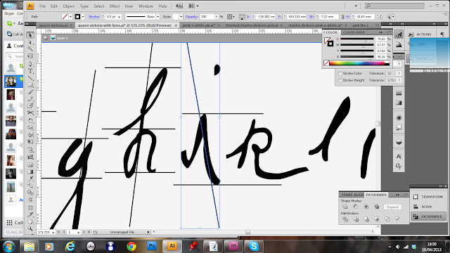
I have started to take the letters that make up the alphabet for Charles Darwin, and I am visualising the angles of the baseline, the x height, etc, and also the angles that each line makes with the horizontal and the line thickness. 


This pattern is now getting a little too complicated. What I have done is positioned the lines so that the letters that correspond with each other line up with each other. However, after consideration, I am just going to line up the baseline lines of the type to create my line pattern now, and focus on creating a pattern that just includes the decender height, the x height, the baseline height and the angle that the type meets the baseline. This will then be recorded on one image, and all of the letters will be recorded with the corresponding angle lines. 


Here I have neatened it up. I have set up a system so that the angle that the letter is written at runs through the centre of the baseline line. Now, I will position all of the x-height lines and type angles to this baseline set-up


I am also documenting which angle lines correspond to each letter. Already I am noticing that the x-heights of a and b are almost identical. This is a very interesting point. 


The letter g is proving particularly difficult to register an angle line that the font makes with the horizontal. In the end, I have chosen to adopt a line that runs half way through the width of the x-height and decender line. 


This is the structure that I am getting up to h. I think that this is very interesting to look at, it is making a very technical line image and representation of the font. Also, most of the lines relate very close to each other which is interesting. It will be very interesting to see how Jack the Ripper, who scrawled his text into the page rather than delicately writing, compares. 


The final pattern that I have made is complicated, but beautifully intricate, exactly as I wanted when I started producing this piece. Now I am going to experiment with smaller stroke thicknesses on all of the lines, and centering of the baseline grid midpoint before I start to experiment with layout and how this could be used in the setting of the gallery space. 


I am currently working on the Jack the ripper font, and I have found that the I actually has an angle to the horizontal that is negative. This should create a really interesting composition of lines. Obveously, for me to gage if this system is working, the Jack the ripper lines must create a much more random pattern as Jack the Rippers writing is the least structured and well written. 


This is my concept from all of these grid lines. I have a problem now, the lines that I have created do not vary enough from person to person. Even Jack the Ripper looks similar in line structure to baseline as Queen Victoria. This is definitely not my intention. I really like the poster concept above, I want to take this idea through to my next concept. I like the structure of the layout, the two columns of text create an interesting asymmetric and balanced composition. However, I need a new way of illustrating the type for the exhibition. I have come up with the idea of exploring graphology. If I did this, I could analyse the writing styles of the famous Victorians with this research. This should be a more interesting way of approaching the analysis of the writing styles of the 5 Victorians. I want something that people will genuinly be interested in reading and learning. At the moment with these lines I have just created abstract dynamic art.